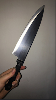
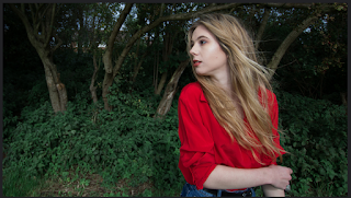
We conducted target audience research using Flickr. By doing this we could receive comments of the public on our photographs. Gaining positive and/or negative responses.
Positive Comments:
- A much better exposure. Could you frame with the supports across the river?
- A lovely shot, it would make a great CU in the music video
- Like - no clutter in the background!
- A super, clean shot with just a little burn out from the flash. I like the diagonal composition.
- I love this shot - great for the music video, you could really get the light to play around and flicker on and off the blade.
- The strength of this is the diagonal composition. You may be able to add artificial flare if you wanted to highlight such.
- I like the location but not sure about the plant and intrusion of the metal on the left.
- Excellent job of keeping the shadows out.
- A lovely shot - could be intriguing if you put blue screen in the mirror and then added the male star moving in it...
- I like this - two objects - two people/ stars - a couple!
- I particularly like this one - but what about the partial plant? I presume that is intentional?
- A lovely shot - you could get this cropped on final cut pro x into an ECU
- What about filming this and highlighting/ emphasising the 'forever' - would that work with your lyrics anywhere?
- Nice shadow less shot. Just need to photoshop out the top right corner.
- A lovely shot - I think you could film this - maybe where there are problems in the lyrics you could separate the cards and show them messy?
- I like this medium shot pose however, she doesn't look very happy, she looks quite bored. I like the dungarees and mustard coloured top too - the make up is good on the female however, the male has very red eyes- perhaps some foundation is needed for him too.
- A lovely shot and I like the way her hair is blowing. Could be really nice cropped for use on the digipak
- I too like the hair blowing. She looks quite worried. A lovely shot
- A lovely expression and pose- could be good for the digipak. It may benefit from cropping.
- Really expressive - I love this shot. Cropping it to just below his hand would really draw their eyes into the shot and to the audience
- A great costume - I think this would be a good costume to use in the music video. She's not looking into camera which you need for promo materials so I wouldn't use it on the digipak or advert.
- A lighting issue here and quite aggressive. He looks washed out.
- This is somewhat better and has attitude. It depends really on what your intended/ preferred meaning is [Hall reception theory]
- That's a nice shot, I like the way he's leaning into her. Very subtle and well posed. It may work on a pane of the digipak
- A lovely shot, nice angle and could be cropped to a great medium shot
- A great shot. Crop it to a medium close up perhaps as the house in the background is distracting
- Back to back shots can have all kinds of 'not seeing eye to eye' connotations. If they are singing, it might be easier for them if they stand in a slight V rather than fully back to back.
- I love this location and think it is really atmospheric. You could place your star in either light or shade. Is his name Jay?


- Are you planning on using this? Is it disused? Remember it is illegal to trespass on used railway tracks!
- The jacket/costume on the male star isn't very effective - it looks too big for him. The lighting washes them out and expressions do not connote positivity.
- A lighting issue here and quite aggressive. He looks washed out.
- Strange pose and expression - quite off putting!
- Why the back of a clock, the ornaments, the shield etc? There is a bike in the shot as well
- For a promo video - it's not very attractive.
- No. What age is your target audience?

Response to Positive:
From what can be seen here in the positive feedback we have received it is clear that our principle photography roughly adheres to the conventions of the Indie genre when looking at the comments and making comparisons to our music video research. I think all but one of the costumes used adhere to conventions of an Indie music and they also attract our TA. We have linked some of the costumes to semiotics and also used them to create synergy for the plans we have for the colour scheme on our digipak. In addition to this we also have reached out to our working class audience by having our artists wearing cheap, casual clothes. We also have a broad range of locations which has also received good feedback, we have a range of different locations that are urban, suburban, busy, abandoned, compact and out in the open so we have near enough ticked all of the boxes for this, we can also link some graffiti at some locations which provides our TA with a small, extra story line within the narratives which may unfold some of the unknown. Some of the poses by our artists within the principle photography adhere to indie conventions yet they also begin to raise questions to the TA, e.g. Why does the female look confused and sad whilst staring into the distance?
Response to Negative:
The first negative comment highlights the fact that it is illegal to walk on train tracks as it is deemed as trespassing and dangerous, therefore we cannot use it in our video which is a shame because we were going to use it as a discrete method to represent journey and how you can roughly predict what is in the near future, but cannot even begin to imagine the long term future. We think this would've been very effective when supporting the narrative towards the TA, we still intend to use it if we can get permission from the owners of a railway that is temporarily out of use in Louth.
The jacket also isn't effective on the male star in the image pictured above and this is understandable, it doesn't really have any colour towards it and looks bland and dead, this could be a reflection on the spirit of the male star in the narrative in the video however this could be portrayed more clearly using semiotics and linking it with clothing. The pose on the photo is also very off putting and I think it washes away the emotion and story lines in the narrative, therefore I agree with this and we will use another image of them for the behind the scenes images that portray them in a different light rather than what is shown on this image.


This is an excellent post Rhea - you really show a good use of feedback and it is clear you are using research to inform planning. Well done.
ReplyDelete